Matplotlib指南:从入门到出版级数据可视化
Matplotlib是Python中最强大的数据可视化库之一,提供从简单图表到出版级图形的完整解决方案。文章介绍了Matplotlib的核心优势,包括高质量输出、跨平台兼容性和丰富的图表类型。重点讲解了七步绘图法:1)创建画板(Figure);2)创建画布(Axes);3)绘制图形;4)设置坐标轴;5)添加标题图例。通过代码示例展示了线图、散点图、柱状图等多种图表实现方法,并详细说明了如何定制坐标
·
数据可视化是数据科学中至关重要的环节,它能将复杂的数据转化为直观的图形,帮助我们更好地理解数据模式和趋势。Matplotlib作为Python最著名的绘图库,提供了从简单图表到出版级质量图形的完整解决方案。
1. Matplotlib简介:为什么选择Matplotlib?
Matplotlib的核心优势
Matplotlib是一个强大的Python 2D绘图库,具有以下显著特点:
- 出版级质量:生成的图表质量足以直接用于学术论文和出版物
- 跨平台兼容:在Windows、Linux、macOS等操作系统上表现一致
- 格式全面:支持导出为PNG、PDF、SVG、EPS等几乎所有常见图形格式
- 高度可定制:从颜色、线型到字体、布局,每个细节都可精确控制
- 丰富的图表类型:支持线图、柱状图、散点图、饼图、3D图等数十种图表
import matplotlib.pyplot as plt
import numpy as np
import matplotlib.font_manager as fm

# 设置中文字体支持
plt.rcParams['font.sans-serif'] = ['SimHei', 'Arial Unicode MS', 'DejaVu Sans']
plt.rcParams['axes.unicode_minus'] = False

print("Matplotlib版本:", plt.__version__)
2. Matplotlib绘图基础:七步绘图法
Matplotlib遵循清晰的绘图流程,掌握这七个步骤就能创建出专业的图表:
步骤1:创建画板(Figure)
def create_figure_demo():
    """创建画板示例"""
    # 创建画板 - 相当于物理画板
    fig = plt.figure(figsize=(10, 6))  # 宽度10英寸,高度6英寸
    fig.suptitle('Matplotlib绘图流程演示', fontsize=16, fontweight='bold')

    return fig

fig = create_figure_demo()
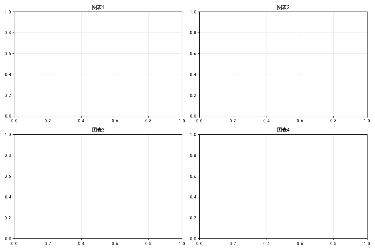
步骤2:创建画布(Axes)
def create_axes_demo():
    """创建画布示例"""
    fig = plt.figure(figsize=(12, 8))

    # 单个画布
    ax1 = fig.add_subplot(2, 2, 1)  # 2行2列的第1个位置
    ax1.set_title('单个画布示例')

    # 多个画布
    ax2 = fig.add_subplot(2, 2, 2)
    ax3 = fig.add_subplot(2, 2, 3)
    ax4 = fig.add_subplot(2, 2, 4)

    # 设置每个子图的标题
    axes = [ax1, ax2, ax3, ax4]
    titles = ['图表1', '图表2', '图表3', '图表4']

    for ax, title in zip(axes, titles):
        ax.set_title(title)
        ax.grid(True, alpha=0.3)

    plt.tight_layout()
    return fig

create_axes_demo()
plt.show()
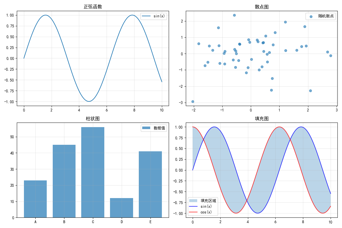
步骤3:绘制图形
def draw_graphics_demo():
    """绘制图形示例"""
    fig, axes = plt.subplots(2, 2, figsize=(12, 8))

    # 生成示例数据
    x = np.linspace(0, 10, 100)
    y1 = np.sin(x)
    y2 = np.cos(x)
    y3 = np.exp(-x/3) * np.sin(3*x)
    y4 = np.tan(x)

    # 1. 线图
    axes[0, 0].plot(x, y1, label='sin(x)')
    axes[0, 0].set_title('正弦函数')

    # 2. 散点图
    x_scatter = np.random.normal(0, 1, 50)
    y_scatter = np.random.normal(0, 1, 50)
    axes[0, 1].scatter(x_scatter, y_scatter, alpha=0.6, label='随机散点')
    axes[0, 1].set_title('散点图')

    # 3. 柱状图
    categories = ['A', 'B', 'C', 'D', 'E']
    values = [23, 45, 56, 12, 41]
    axes[1, 0].bar(categories, values, alpha=0.7, label='数据值')
    axes[1, 0].set_title('柱状图')

    # 4. 填充图
    axes[1, 1].fill_between(x, y1, y2, alpha=0.3, label='填充区域')
    axes[1, 1].plot(x, y1, 'b-', alpha=0.8, label='sin(x)')
    axes[1, 1].plot(x, y2, 'r-', alpha=0.8, label='cos(x)')
    axes[1, 1].set_title('填充图')

    # 为所有子图添加图例
    for ax in axes.flat:
        ax.legend()
        ax.grid(True, alpha=0.3)

    plt.tight_layout()
    return fig

draw_graphics_demo()
plt.show()
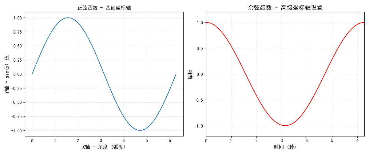
步骤4:设置坐标轴标签
def set_axis_labels_demo():
    """设置坐标轴标签示例"""
    fig, (ax1, ax2) = plt.subplots(1, 2, figsize=(12, 5))

    x = np.linspace(0, 2*np.pi, 100)
    y_sin = np.sin(x)
    y_cos = np.cos(x)

    # 基本坐标轴设置
    ax1.plot(x, y_sin)
    ax1.set_xlabel('X轴 - 角度 (弧度)', fontsize=12)
    ax1.set_ylabel('Y轴 - sin(x) 值', fontsize=12)
    ax1.set_title('正弦函数 - 基础坐标轴')

    # 高级坐标轴设置
    ax2.plot(x, y_cos, color='red')
    ax2.set_xlabel('时间 (秒)', fontsize=12, fontweight='bold')
    ax2.set_ylabel('振幅', fontsize=12, fontweight='bold')
    ax2.set_title('余弦函数 - 高级坐标轴设置', fontsize=14)

    # 设置坐标轴范围
    ax2.set_xlim(0, 2*np.pi)
    ax2.set_ylim(-1.2, 1.2)

    # 设置网格
    ax1.grid(True, alpha=0.3, linestyle='--')
    ax2.grid(True, alpha=0.3, linestyle=':')

    plt.tight_layout()
    return fig

set_axis_labels_demo()
plt.show()
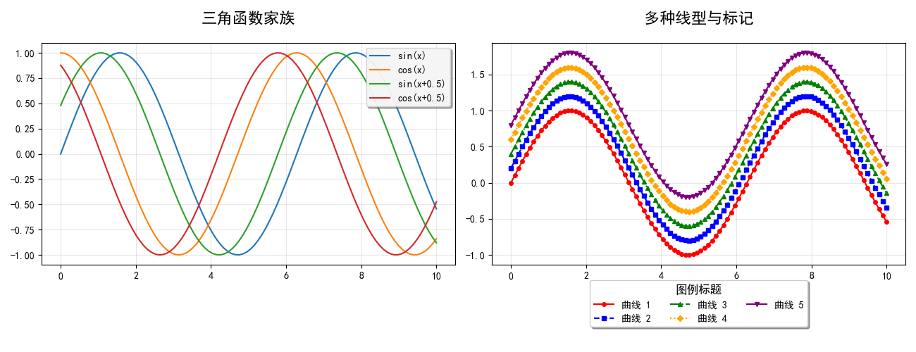
步骤5:设置标题和图例
def set_title_legend_demo():
    """设置标题和图例示例"""
    fig, (ax1, ax2) = plt.subplots(1, 2, figsize=(13, 5))

    x = np.linspace(0, 10, 100)

    # 多种线型演示
    ax1.plot(x, np.sin(x), label='sin(x)')
    ax1.plot(x, np.cos(x), label='cos(x)')
    ax1.plot(x, np.sin(x + 0.5), label='sin(x+0.5)')
    ax1.plot(x, np.cos(x + 0.5), label='cos(x+0.5)')

    # 设置标题
    ax1.set_title('三角函数家族', fontsize=16, fontweight='bold', pad=20)

    # 设置图例 - 位置调整
    ax1.legend(loc='upper right', frameon=True, fancybox=True,
               shadow=True, framealpha=0.9)

    # 复杂图例示例
    colors = ['red', 'blue', 'green', 'orange', 'purple']
    linestyles = ['-', '--', '-.', ':', '-']
    markers = ['o', 's', '^', 'D', 'v']

    for i in range(5):
        y = np.sin(x) + 0.2 * i
        ax2.plot(x, y, color=colors[i], linestyle=linestyles[i],
                marker=markers[i], markersize=4, label=f'曲线 {i+1}')

    ax2.set_title('多种线型与标记', fontsize=16, fontweight='bold', pad=20)

    # 复杂图例设置
    ax2.legend(loc='lower center', bbox_to_anchor=(0.5, -0.3),
              ncol=3, frameon=True, shadow=True,
              title='图例标题', title_fontsize=12)

    ax1.grid(True, alpha=0.3)
    ax2.grid(True, alpha=0.3)

    plt.tight_layout()
    return fig

set_title_legend_demo()
plt.show()
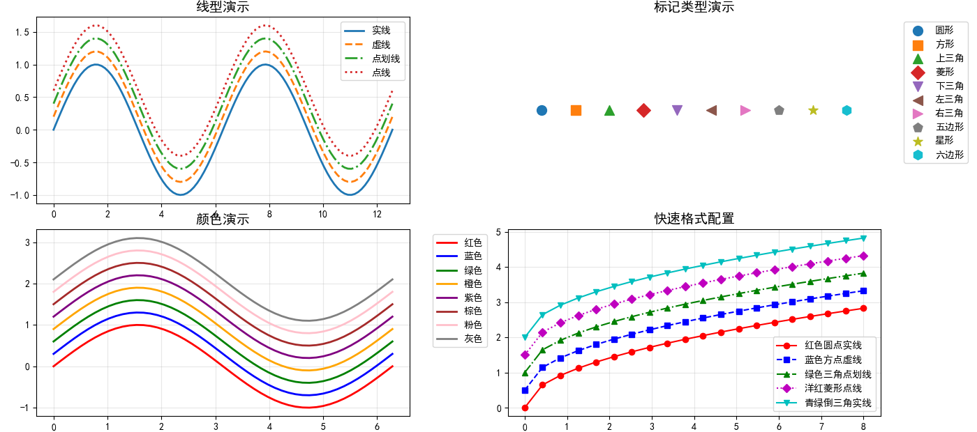
步骤6:图形调整
线型、标记和颜色调整
def graphic_adjustment_demo():
    """图形调整示例 - 线型、标记和颜色"""
    fig = plt.figure(figsize=(14, 10))

    # 1. 线型演示
    ax1 = fig.add_subplot(2, 2, 1)
    linestyles = ['-', '--', '-.', ':']
    labels = ['实线', '虚线', '点划线', '点线']

    x = np.linspace(0, 4*np.pi, 100)
    for i, ls in enumerate(linestyles):
        y = np.sin(x) + i * 0.2
        ax1.plot(x, y, linestyle=ls, linewidth=2, label=labels[i])

    ax1.set_title('线型演示', fontsize=14)
    ax1.legend()
    ax1.grid(True, alpha=0.3)

    # 2. 标记演示
    ax2 = fig.add_subplot(2, 2, 2)
    markers = ['o', 's', '^', 'D', 'v', '<', '>', 'p', '*', 'h']
    marker_labels = ['圆形', '方形', '上三角', '菱形', '下三角',
                    '左三角', '右三角', '五边形', '星形', '六边形']

    x_marker = range(len(markers))
    for i, marker in enumerate(markers):
        ax2.scatter(i, 0, marker=marker, s=100, label=marker_labels[i])

    ax2.set_xlim(-1, len(markers))
    ax2.set_ylim(-0.5, 0.5)
    ax2.set_title('标记类型演示', fontsize=14)
    ax2.legend(bbox_to_anchor=(1.05, 1), loc='upper left')
    ax2.axis('off')

    # 3. 颜色演示
    ax3 = fig.add_subplot(2, 2, 3)
    colors = ['red', 'blue', 'green', 'orange', 'purple', 'brown', 'pink', 'gray']
    color_names = ['红色', '蓝色', '绿色', '橙色', '紫色', '棕色', '粉色', '灰色']

    x_color = np.linspace(0, 2*np.pi, 50)
    for i, color in enumerate(colors):
        y = np.sin(x_color) + i * 0.3
        ax3.plot(x_color, y, color=color, linewidth=2, label=color_names[i])

    ax3.set_title('颜色演示', fontsize=14)
    ax3.legend(bbox_to_anchor=(1.05, 1), loc='upper left')
    ax3.grid(True, alpha=0.3)

    # 4. 快速配置演示
    ax4 = fig.add_subplot(2, 2, 4)

    # 快速配置格式字符串: [颜色][标记][线型]
    formats = ['ro-', 'bs--', 'g^-.', 'mD:', 'cv-']
    format_labels = ['红色圆点实线', '蓝色方点虚线', '绿色三角点划线',
                    '洋红菱形点线', '青绿倒三角实线']

    x_fmt = np.linspace(0, 8, 20)
    for i, fmt in enumerate(formats):
        y = np.sqrt(x_fmt) + i * 0.5
        ax4.plot(x_fmt, y, fmt, markersize=6, label=format_labels[i])

    ax4.set_title('快速格式配置', fontsize=14)
    ax4.legend()
    ax4.grid(True, alpha=0.3)

    plt.tight_layout()
    return fig

graphic_adjustment_demo()
plt.show()
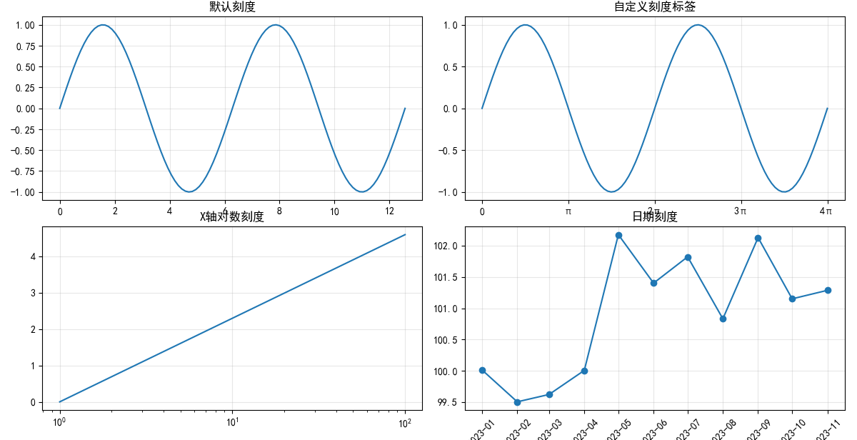
坐标轴刻度调整
def axis_adjustment_demo():
    """坐标轴刻度调整示例"""
    fig, axes = plt.subplots(2, 2, figsize=(12, 10))

    x = np.linspace(0, 4 * np.pi, 100)
    y = np.sin(x)

    # 1. 基本刻度设置
    axes[0, 0].plot(x, y)
    axes[0, 0].set_title('默认刻度')
    axes[0, 0].grid(True, alpha=0.3)

    # 2. 自定义刻度
    axes[0, 1].plot(x, y)
    axes[0, 1].set_xticks([0, np.pi, 2 * np.pi, 3 * np.pi, 4 * np.pi])
    axes[0, 1].set_xticklabels(['0', 'π', '2π', '3π', '4π'])
    axes[0, 1].set_yticks([-1, -0.5, 0, 0.5, 1])
    axes[0, 1].set_title('自定义刻度标签')
    axes[0, 1].grid(True, alpha=0.3)

    # 3. 对数刻度
    x_log = np.linspace(1, 100, 100)
    y_log = np.log(x_log)

    axes[1, 0].plot(x_log, y_log)
    axes[1, 0].set_xscale('log')
    axes[1, 0].set_title('X轴对数刻度')
    axes[1, 0].grid(True, alpha=0.3)

    # 4. 日期刻度(模拟)
    dates = np.arange('2023-01', '2023-12', dtype='datetime64[M]')
    values = np.random.randn(11).cumsum() + 100

    axes[1, 1].plot(dates, values, marker='o')
    axes[1, 1].set_title('日期刻度')
    axes[1, 1].tick_params(axis='x', rotation=45)
    axes[1, 1].grid(True, alpha=0.3)

    plt.tight_layout()
    return fig

axis_adjustment_demo()
plt.show()
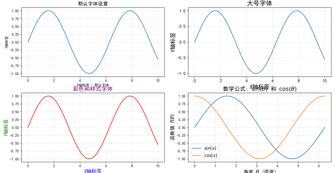
字体调整
def font_adjustment_demo():
    """字体调整示例"""
    fig, axes = plt.subplots(2, 2, figsize=(13, 10))

    x = np.linspace(0, 10, 100)
    y = np.sin(x)

    # 1. 默认字体
    axes[0, 0].plot(x, y)
    axes[0, 0].set_xlabel('X轴标签 - 默认字体')
    axes[0, 0].set_ylabel('Y轴标签')
    axes[0, 0].set_title('默认字体设置', fontsize=14)
    axes[0, 0].grid(True, alpha=0.3)

    # 2. 自定义字体大小
    axes[0, 1].plot(x, y)
    axes[0, 1].set_xlabel('X轴标签', fontsize=16)
    axes[0, 1].set_ylabel('Y轴标签', fontsize=16)
    axes[0, 1].set_title('大号字体', fontsize=18, fontweight='bold')
    axes[0, 1].tick_params(axis='both', which='major', labelsize=12)
    axes[0, 1].grid(True, alpha=0.3)

    # 3. 字体样式和颜色
    axes[1, 0].plot(x, y, color='red')
    axes[1, 0].set_xlabel('X轴标签', fontsize=14, fontstyle='italic', color='blue')
    axes[1, 0].set_ylabel('Y轴标签', fontsize=14, fontweight='bold', color='green')
    axes[1, 0].set_title('彩色和样式字体', fontsize=16,
                        fontweight='bold', fontstyle='italic', color='purple')
    axes[1, 0].grid(True, alpha=0.3)

    # 4. 数学公式字体
    x_math = np.linspace(0, 2*np.pi, 100)
    y1_math = np.sin(x_math)
    y2_math = np.cos(x_math)

    axes[1, 1].plot(x_math, y1_math, label=r'$\sin(x)$')
    axes[1, 1].plot(x_math, y2_math, label=r'$\cos(x)$')
    axes[1, 1].set_xlabel(r'角度 $\theta$ (弧度)', fontsize=14)
    axes[1, 1].set_ylabel(r'函数值 $f(\theta)$', fontsize=14)
    axes[1, 1].set_title(r'数学公式: $\sin(\theta)$ 和 $\cos(\theta)$', fontsize=16)
    axes[1, 1].legend(fontsize=12)
    axes[1, 1].grid(True, alpha=0.3)

    plt.tight_layout()
    return fig

font_adjustment_demo()
plt.show()
步骤7:保存图片
def save_picture_demo():
    """保存图片示例"""
    # 创建示例图表
    fig, ax = plt.subplots(figsize=(10, 6))

    x = np.linspace(0, 10, 100)
    y1 = np.sin(x)
    y2 = np.cos(x)

    ax.plot(x, y1, 'b-', label='sin(x)')
    ax.plot(x, y2, 'r--', label='cos(x)')
    ax.set_xlabel('X轴')
    ax.set_ylabel('Y轴')
    ax.set_title('图表保存示例')
    ax.legend()
    ax.grid(True, alpha=0.3)

    # 保存为不同格式
    formats = {
        'PNG': ('output_chart.png', {'dpi': 300}),
        'PDF': ('output_chart.pdf', {}),
        'SVG': ('output_chart.svg', {}),
        'JPEG': ('output_chart.jpg', {'quality': 95}),
        'TIFF': ('output_chart.tiff', {'dpi': 300})
    }

    print("保存图表格式演示:")
    for format_name, (filename, kwargs) in formats.items():
        try:
            plt.savefig(filename, bbox_inches='tight', **kwargs)
            print(f"✓ 成功保存为 {format_name}: {filename}")
        except Exception as e:
            print(f"✗ 保存 {format_name} 失败: {e}")

    plt.show()
    return fig

save_picture_demo()
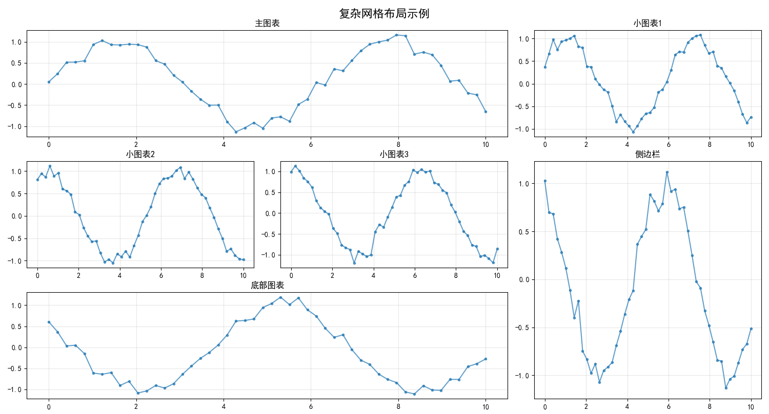
3. 高级技巧:多子图布局
def advanced_subplots_demo():
"""高级多子图布局示例"""
# 1. 复杂网格布局
fig = plt.figure(figsize=(15, 10))
# 创建复杂的网格布局
gs = fig.add_gridspec(3, 3)
# 左上角大图
ax1 = fig.add_subplot(gs[0, :2])
# 右上角小图
ax2 = fig.add_subplot(gs[0, 2])
# 底部左侧
ax3 = fig.add_subplot(gs[1, 0])
# 底部中间
ax4 = fig.add_subplot(gs[1, 1])
# 底部右侧(跨两行)
ax5 = fig.add_subplot(gs[1:, 2])
# 底部跨两列
ax6 = fig.add_subplot(gs[2, :2])
# 为每个子图添加内容
axes = [ax1, ax2, ax3, ax4, ax5, ax6]
titles = ['主图表', '小图表1', '小图表2', '小图表3', '侧边栏', '底部图表']
for i, (ax, title) in enumerate(zip(axes, titles)):
x = np.linspace(0, 10, 50)
y = np.sin(x + i * 0.5) + np.random.normal(0, 0.1, 50)
ax.plot(x, y, marker='o', markersize=3, linestyle='-', alpha=0.7)
ax.set_title(title, fontsize=12)
ax.grid(True, alpha=0.3)
fig.suptitle('复杂网格布局示例', fontsize=16, fontweight='bold')
plt.tight_layout()
# 保存这个复杂布局
plt.savefig('complex_layout.png', dpi=300, bbox_inches='tight')
plt.show()
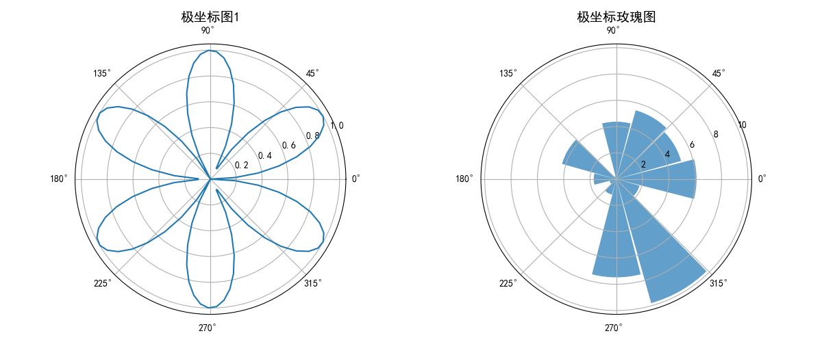
# 2. 极坐标图示例
fig2, (ax1, ax2) = plt.subplots(1, 2, figsize=(12, 5),
subplot_kw=dict(projection='polar'))
theta = np.linspace(0, 2*np.pi, 100)
r = np.abs(np.sin(3*theta))
ax1.plot(theta, r)
ax1.set_title('极坐标图1', fontsize=14)
# 玫瑰图
n_angles = 12
angles = np.linspace(0, 2*np.pi, n_angles, endpoint=False)
values = np.random.rand(n_angles) * 10
ax2.bar(angles, values, alpha=0.7, width=0.5)
ax2.set_title('极坐标玫瑰图', fontsize=14)
plt.tight_layout()
plt.show()
return fig, fig2
advanced_subplots_demo()
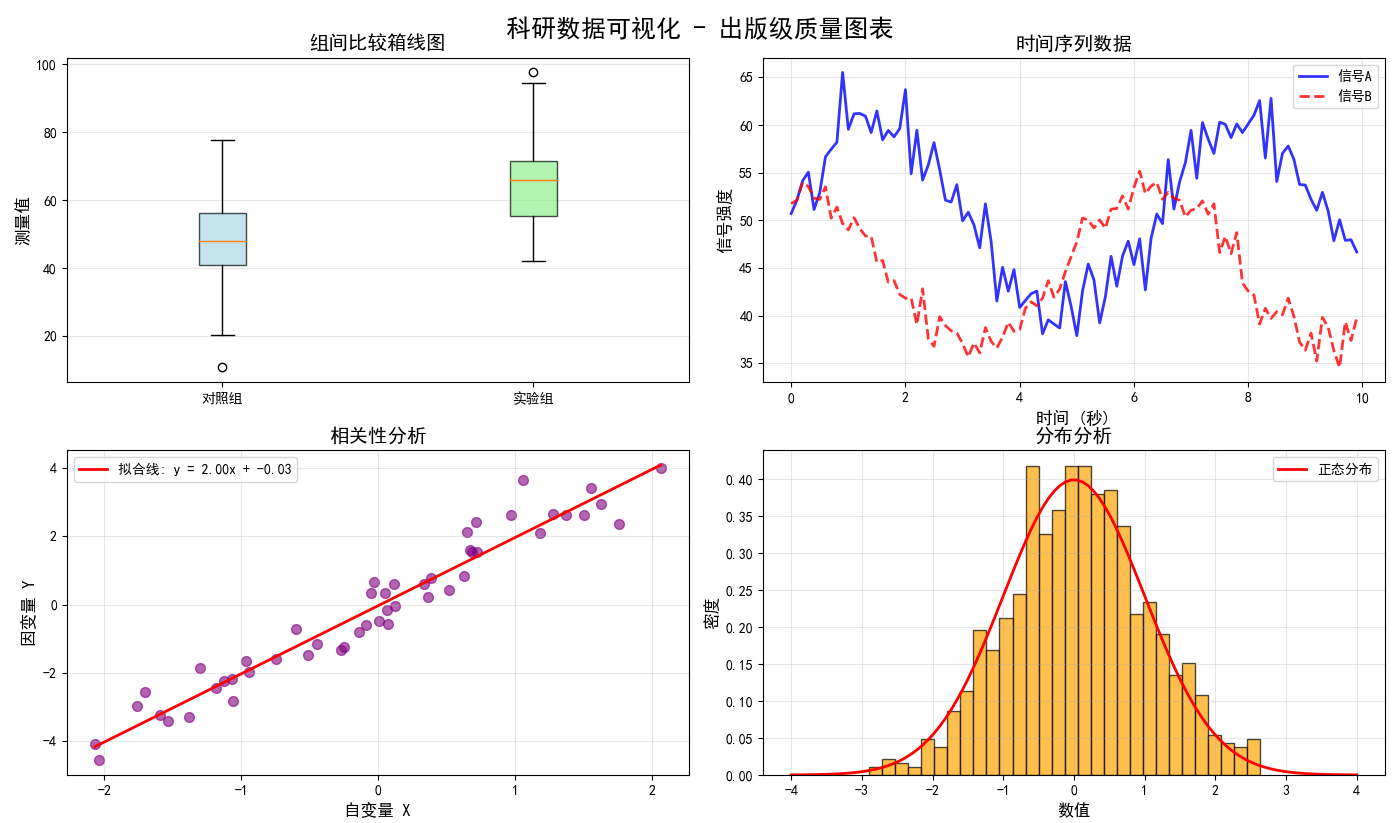
4. 实战案例:创建出版级图表
def publication_quality_chart():
    """创建出版级质量图表"""

    # 模拟科研数据
    np.random.seed(42)

    # 实验组和对照组数据
    control_group = np.random.normal(50, 15, 100)
    treatment_group = np.random.normal(65, 12, 100)

    # 时间序列数据
    time_points = np.arange(0, 10, 0.1)
    signal_a = 50 + 10 * np.sin(time_points) + np.random.normal(0, 2, len(time_points))
    signal_b = 45 + 8 * np.cos(time_points) + np.random.normal(0, 1.5, len(time_points))

    # 创建出版级图表
    fig, axes = plt.subplots(2, 2, figsize=(14, 10))

    # 1. 箱线图比较
    box_data = [control_group, treatment_group]
    box_labels = ['对照组', '实验组']

    bp = axes[0, 0].boxplot(box_data, labels=box_labels, patch_artist=True)

    # 美化箱线图
    colors = ['lightblue', 'lightgreen']
    for patch, color in zip(bp['boxes'], colors):
        patch.set_facecolor(color)
        patch.set_alpha(0.7)

    axes[0, 0].set_ylabel('测量值', fontsize=12)
    axes[0, 0].set_title('组间比较箱线图', fontsize=14, fontweight='bold')
    axes[0, 0].grid(True, alpha=0.3, axis='y')

    # 2. 时间序列图
    axes[0, 1].plot(time_points, signal_a, 'b-', linewidth=2, label='信号A', alpha=0.8)
    axes[0, 1].plot(time_points, signal_b, 'r--', linewidth=2, label='信号B', alpha=0.8)
    axes[0, 1].set_xlabel('时间 (秒)', fontsize=12)
    axes[0, 1].set_ylabel('信号强度', fontsize=12)
    axes[0, 1].set_title('时间序列数据', fontsize=14, fontweight='bold')
    axes[0, 1].legend(fontsize=10)
    axes[0, 1].grid(True, alpha=0.3)

    # 3. 散点图与拟合线
    x_scatter = np.random.normal(0, 1, 50)
    y_scatter = 2 * x_scatter + np.random.normal(0, 0.5, 50)

    axes[1, 0].scatter(x_scatter, y_scatter, alpha=0.6, color='purple', s=50)

    # 添加拟合线
    z = np.polyfit(x_scatter, y_scatter, 1)
    p = np.poly1d(z)
    x_fit = np.linspace(x_scatter.min(), x_scatter.max(), 100)
    axes[1, 0].plot(x_fit, p(x_fit), 'r-', linewidth=2,
                   label=f'拟合线: y = {z[0]:.2f}x + {z[1]:.2f}')

    axes[1, 0].set_xlabel('自变量 X', fontsize=12)
    axes[1, 0].set_ylabel('因变量 Y', fontsize=12)
    axes[1, 0].set_title('相关性分析', fontsize=14, fontweight='bold')
    axes[1, 0].legend(fontsize=10)
    axes[1, 0].grid(True, alpha=0.3)

    # 4. 直方图与密度曲线
    data_hist = np.random.normal(0, 1, 1000)

    n, bins, patches = axes[1, 1].hist(data_hist, bins=30, density=True,
                                      alpha=0.7, color='orange', edgecolor='black')

    # 添加正态分布曲线
    from scipy.stats import norm
    x_norm = np.linspace(-4, 4, 100)
    y_norm = norm.pdf(x_norm)
    axes[1, 1].plot(x_norm, y_norm, 'r-', linewidth=2, label='正态分布')

    axes[1, 1].set_xlabel('数值', fontsize=12)
    axes[1, 1].set_ylabel('密度', fontsize=12)
    axes[1, 1].set_title('分布分析', fontsize=14, fontweight='bold')
    axes[1, 1].legend(fontsize=10)
    axes[1, 1].grid(True, alpha=0.3)

    # 整体设置
    fig.suptitle('科研数据可视化 - 出版级质量图表',
                fontsize=18, fontweight='bold', y=0.98)

    # 调整布局
    plt.tight_layout()
    plt.subplots_adjust(top=0.93)

    # 保存为高分辨率图片
    plt.savefig('publication_quality_chart.png', dpi=600, bbox_inches='tight',
               facecolor='white', edgecolor='none')

    plt.show()

    print("出版级图表已创建并保存为 'publication_quality_chart.png'")

    return fig

publication_quality_chart()
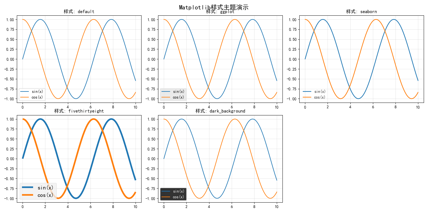
5. 样式主题和颜色方案
def style_and_themes_demo():
"""样式主题和颜色方案演示"""
# 查看可用的样式
available_styles = plt.style.available
print("可用的Matplotlib样式:")
for i, style in enumerate(available_styles[:10]): # 只显示前10个
print(f"{i+1}. {style}")
# 使用不同样式创建图表
styles_to_demo = ['default', 'ggplot', 'seaborn', 'fivethirtyeight', 'dark_background']
fig, axes = plt.subplots(2, 3, figsize=(15, 10))
axes = axes.flat
x = np.linspace(0, 10, 100)
for i, style in enumerate(styles_to_demo):
if i >= len(axes):
break
with plt.style.context(style):
ax_temp = axes[i]
y1 = np.sin(x)
y2 = np.cos(x)
ax_temp.plot(x, y1, label='sin(x)')
ax_temp.plot(x, y2, label='cos(x)')
ax_temp.set_title(f'样式: {style}', fontsize=12)
ax_temp.legend()
ax_temp.grid(True, alpha=0.3)
# 隐藏多余的子图
for i in range(len(styles_to_demo), len(axes)):
axes[i].set_visible(False)
fig.suptitle('Matplotlib样式主题演示', fontsize=16, fontweight='bold')
plt.tight_layout()
plt.show()
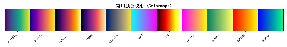
# 颜色映射演示
fig, ax = plt.subplots(figsize=(12, 2))
# 创建颜色条展示不同的colormap
gradient = np.linspace(0, 1, 256).reshape(1, -1)
popular_cmaps = ['viridis', 'plasma', 'inferno', 'magma', 'cividis',
'cool', 'hot', 'spring', 'summer', 'autumn', 'winter']
for i, cmap_name in enumerate(popular_cmaps):
ax.imshow(gradient, aspect='auto', cmap=plt.get_cmap(cmap_name),
extent=[i, i+1, 0, 1])
ax.set_xlim(0, len(popular_cmaps))
ax.set_ylim(0, 1)
ax.set_yticks([])
ax.set_xticks(np.arange(len(popular_cmaps)) + 0.5)
ax.set_xticklabels(popular_cmaps, rotation=45, ha='right')
ax.set_title('常用颜色映射 (Colormaps)', fontsize=14, fontweight='bold')
plt.tight_layout()
plt.show()
style_and_themes_demo()
6. 交互式可视化
def interactive_visualization_demo():
    """交互式可视化演示"""

    try:
        # 启用交互模式
        plt.ion()

        # 创建动态更新的图表
        fig, ax = plt.subplots(figsize=(10, 6))

        x = np.linspace(0, 4*np.pi, 100)

        for phase in np.linspace(0, 2*np.pi, 20):
            # 清除当前图形
            ax.clear()

            # 计算新的y值
            y = np.sin(x + phase)

            # 绘制新图形
            ax.plot(x, y, 'b-', linewidth=2)
            ax.set_xlim(0, 4*np.pi)
            ax.set_ylim(-1.2, 1.2)
            ax.set_xlabel('X轴')
            ax.set_ylabel('Y轴')
            ax.set_title(f'动态正弦波 - 相位: {phase:.2f}')
            ax.grid(True, alpha=0.3)

            # 更新图形
            plt.draw()
            plt.pause(0.1)

        # 关闭交互模式
        plt.ioff()

    except Exception as e:
        print(f"交互式演示需要图形界面支持: {e}")
        plt.ioff()

# 谨慎运行,因为这会创建动画
# interactive_visualization_demo()
7. 最佳实践总结
图表设计原则
-
清晰易读
- 选择合适的图表类型
- 使用清晰的标签和标题
- 避免过度装饰
-
一致性
- 保持颜色、字体、样式的一致性
- 使用统一的坐标轴范围
-
准确性
- 确保数据准确表示
- 使用适当的比例尺
- 避免误导性的视觉元素
性能优化技巧
def performance_tips():
    """性能优化技巧演示"""

    # 大数据集优化
    large_x = np.linspace(0, 100000, 1000000)
    large_y = np.sin(large_x / 1000)

    fig, (ax1, ax2) = plt.subplots(1, 2, figsize=(12, 5))

    # 不优化的绘制(可能很慢)
    import time

    start_time = time.time()
    ax1.plot(large_x, large_y, alpha=0.7)
    ax1.set_title('原始数据绘制', fontsize=14)
    ax1.grid(True, alpha=0.3)
    time1 = time.time() - start_time

    # 优化的绘制(下采样)
    start_time = time.time()
    # 每100个点取一个点
    sampled_indices = np.arange(0, len(large_x), 100)
    ax2.plot(large_x[sampled_indices], large_y[sampled_indices], alpha=0.7)
    ax2.set_title('下采样数据绘制', fontsize=14)
    ax2.grid(True, alpha=0.3)
    time2 = time.time() - start_time

    print(f"原始绘制时间: {time1:.4f}秒")
    print(f"优化绘制时间: {time2:.4f}秒")
    print(f"性能提升: {time1/time2:.1f}倍")

    plt.tight_layout()
    plt.show()

performance_tips()
常用图表类型速查
def chart_type_cheatsheet():
    """常用图表类型速查"""

    fig, axes = plt.subplots(2, 3, figsize=(15, 10))

    # 1. 线图 - 趋势分析
    x = np.linspace(0, 10, 100)
    axes[0, 0].plot(x, np.sin(x), 'b-', label='sin(x)')
    axes[0, 0].plot(x, np.cos(x), 'r--', label='cos(x)')
    axes[0, 0].set_title('线图 - 趋势分析')
    axes[0, 0].legend()
    axes[0, 0].grid(True, alpha=0.3)

    # 2. 散点图 - 相关性分析
    x_scatter = np.random.randn(50)
    y_scatter = 2 * x_scatter + np.random.randn(50) * 0.5
    axes[0, 1].scatter(x_scatter, y_scatter, alpha=0.6, c=x_scatter, cmap='viridis')
    axes[0, 1].set_title('散点图 - 相关性分析')
    axes[0, 1].grid(True, alpha=0.3)

    # 3. 柱状图 - 分类比较
    categories = ['A', 'B', 'C', 'D', 'E']
    values = [23, 45, 56, 12, 41]
    axes[0, 2].bar(categories, values, alpha=0.7, color=['red', 'blue', 'green', 'orange', 'purple'])
    axes[0, 2].set_title('柱状图 - 分类比较')
    axes[0, 2].grid(True, alpha=0.3, axis='y')

    # 4. 直方图 - 分布分析
    data = np.random.normal(0, 1, 1000)
    axes[1, 0].hist(data, bins=30, alpha=0.7, density=True, edgecolor='black')
    axes[1, 0].set_title('直方图 - 分布分析')
    axes[1, 0].grid(True, alpha=0.3)

    # 5. 箱线图 - 统计摘要
    data1 = np.random.normal(0, 1, 100)
    data2 = np.random.normal(2, 1.5, 100)
    axes[1, 1].boxplot([data1, data2], labels=['组1', '组2'])
    axes[1, 1].set_title('箱线图 - 统计摘要')
    axes[1, 1].grid(True, alpha=0.3, axis='y')

    # 6. 饼图 - 比例分析
    sizes = [15, 30, 45, 10]
    labels = ['A', 'B', 'C', 'D']
    axes[1, 2].pie(sizes, labels=labels, autopct='%1.1f%%', startangle=90)
    axes[1, 2].set_title('饼图 - 比例分析')

    fig.suptitle('常用图表类型速查', fontsize=16, fontweight='bold')
    plt.tight_layout()
    plt.show()

chart_type_cheatsheet()
8. 总结
Matplotlib是Python数据可视化的基石,通过本指南的学习,你应该已经掌握了:
核心技能
- 七步绘图法:Figure → Axes → 绘图 → 标签 → 标题图例 → 调整 → 保存
- 图形定制:线型、颜色、标记、字体、坐标轴的精细控制
- 多子图布局:复杂网格和极坐标图的创建
- 出版级质量:创建适合学术论文的高质量图表
进阶技巧
- 样式主题和颜色映射的使用
- 大数据集性能优化
- 交互式可视化
- 多种图表类型的适用场景
最佳实践
- 始终从简单图表开始,逐步添加复杂元素
- 保持视觉元素的一致性
- 选择最能清晰传达信息的图表类型
- 考虑目标受众和发布平台的要求
Matplotlib的学习曲线可能较陡峭,但一旦掌握,你将能够创建几乎任何类型的数据可视化。记住:好的可视化不仅能展示数据,更能讲述故事和传递洞察。
继续实践和探索,你会发现Matplotlib在科学研究、商业分析、教育教学等领域的无限可能性!

葡萄城是专业的软件开发技术和低代码平台提供商,聚焦软件开发技术,以“赋能开发者”为使命,致力于通过表格控件、低代码和BI等各类软件开发工具和服务
更多推荐


 27
27 0
0- 0


 已为社区贡献1条内容

所有评论(0)