原子化 CSS 组件库——Tailwind 与 Design Token 的融合
文章目录

每日一句正能量
“慢一点没关系,只要方向清晰,每一步都在靠近真实的自己。”
只要每一步都在忠于内心、认识自我的路上,哪怕步伐微小,时间拉长,都是在进行有价值的积累。
前言
在样式工程化的演进过程中,开发者一直在"灵活性"与"一致性"之间寻找平衡点。传统的 CSS 框架如 Bootstrap 提供了预置组件,却难以定制;CSS-in-JS 方案如 Styled Components 赋予了极高的灵活性,却带来了运行时开销。Tailwind CSS 以原子化工具类的思路打开了新的局面,而将其与 Design Token 体系深度融合,则是 Codex 官网在样式架构上的核心策略。
一、Tailwind 在 Codex 官网中的使用深度
Tailwind CSS 的核心理念是"utility-first"——通过组合大量细粒度的工具类来构建界面,而非编写自定义 CSS。在 Codex 官网中,Tailwind 的使用分为三个层次:
第一层是直接在 JSX 中书写工具类。这是最基础的使用方式,适用于简单组件和一次性布局。例如一个卡片组件可以直接写成 className="rounded-lg border border-border bg-surface p-6 shadow-sm",无需额外编写 CSS 文件。
第二层是通过 @apply 进行组件抽象。当某个样式组合在多个地方重复出现时,我们将其提取为 CSS 组件类。这种方式保留了 Tailwind 的设计语言,同时降低了模板中的类名冗余。
第三层是自定义插件扩展。Tailwind 的插件系统允许团队根据品牌规范创建专属的工具类,如 text-balance、animation-fade-up 等,这些扩展与原生工具类无缝融合。
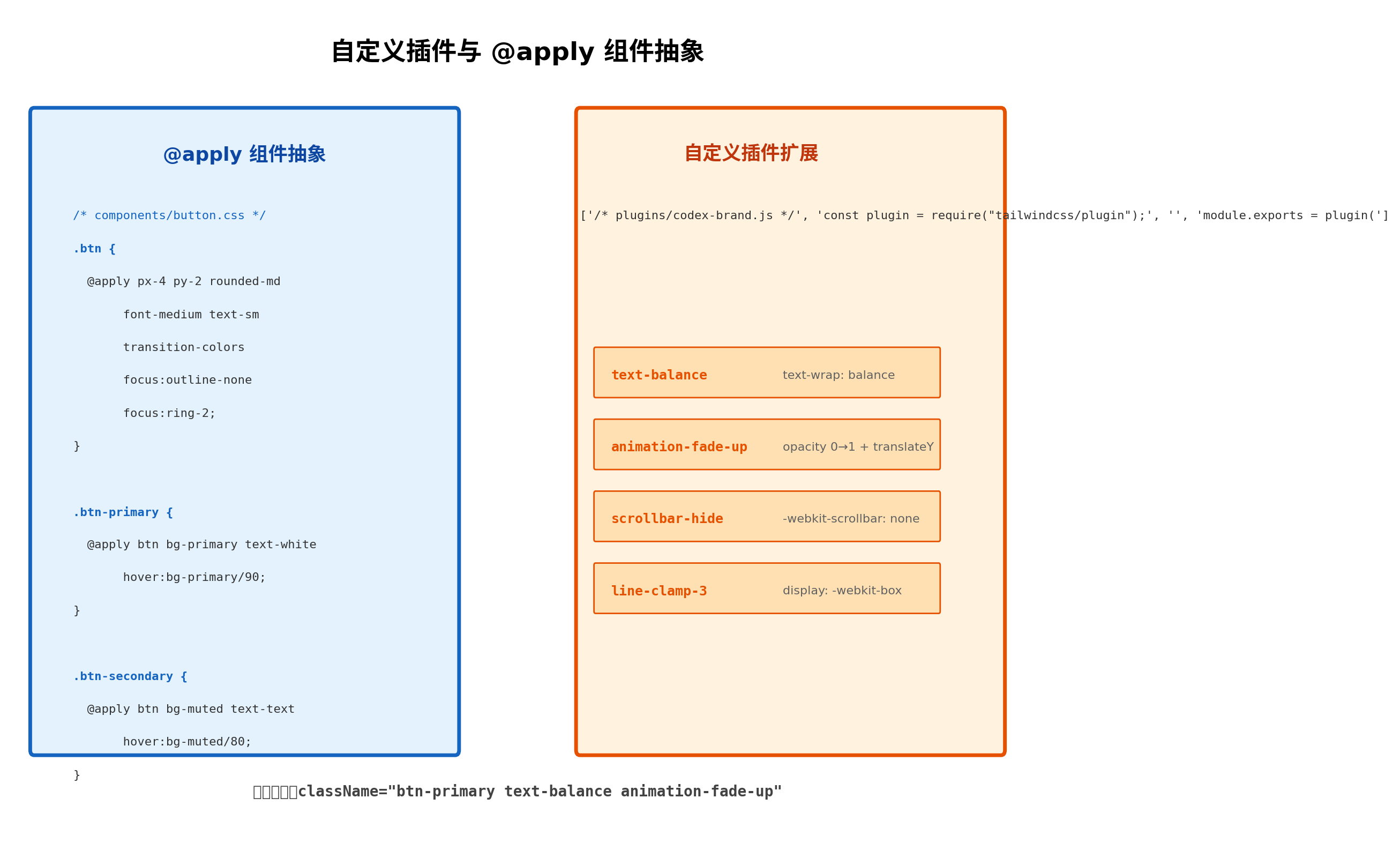
@apply 的使用需要把握分寸。过度使用会退回到传统 CSS 的命名困境,完全不用则会导致 HTML 中类名过长。Codex 的实践准则是:同一组工具类在三个及以上地方出现时,就值得用 @apply 提取。
二、Design Token 注入 Tailwind:一处修改,全局生效
Design Token 是设计系统中的"原子",它将颜色、间距、字体、圆角等视觉属性抽象为命名变量,形成设计与开发之间的通用语言。Codex 官网采用三层 Token 架构:全局 Token(Global)定义原始值,如 --color-blue-500: #3B82F6;语义 Token(Semantic)建立业务含义,如 --color-primary: var(--color-blue-500);组件 Token(Component)则面向具体组件,如 --button-bg: var(--color-primary)。
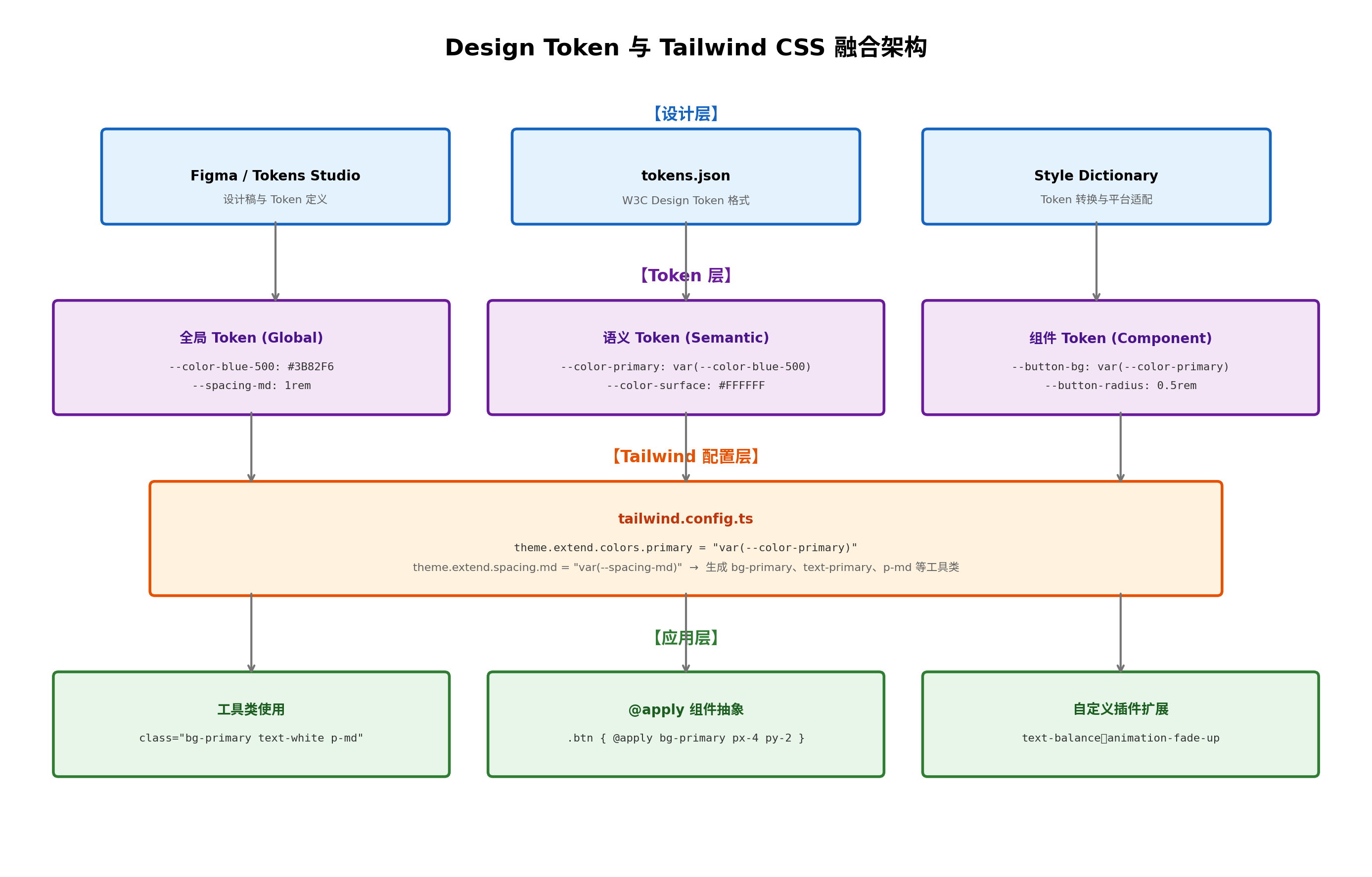
将 Design Token 注入 Tailwind 的关键在于 tailwind.config.ts 的 theme.extend 配置。我们不直接在配置中写死色值,而是引用 CSS 变量:
// tailwind.config.ts
import type { Config } from 'tailwindcss';

const config: Config = {
  content: ['./src/**/*.{js,ts,jsx,tsx}'],
  theme: {
    extend: {
      colors: {
        primary: 'var(--color-primary)',
        surface: 'var(--color-surface)',
        text: 'var(--color-text)',
        border: 'var(--color-border)',
        muted: 'var(--color-muted)',
        danger: 'var(--color-danger)',
        success: 'var(--color-success)',
      },
      spacing: {
        xs: 'var(--spacing-xs)',
        sm: 'var(--spacing-sm)',
        md: 'var(--spacing-md)',
        lg: 'var(--spacing-lg)',
        xl: 'var(--spacing-xl)',
      },
      borderRadius: {
        sm: 'var(--radius-sm)',
        md: 'var(--radius-md)',
        lg: 'var(--radius-lg)',
      },
      fontFamily: {
        sans: ['var(--font-sans)', 'system-ui', 'sans-serif'],
        mono: ['var(--font-mono)', 'monospace'],
      },
    },
  },
  plugins: [require('./plugins/codex-brand')],
};

export default config;
CSS 变量定义在全局样式表中,通常在 :root 选择器下声明:
/* styles/tokens.css */
:root {
  --color-primary: #3B82F6;
  --color-surface: #FFFFFF;
  --color-text: #1F2937;
  --color-border: #E5E7EB;
  --color-muted: #F3F4F6;
  --color-danger: #EF4444;
  --color-success: #22C55E;

  --spacing-xs: 0.25rem;
  --spacing-sm: 0.5rem;
  --spacing-md: 1rem;
  --spacing-lg: 1.5rem;
  --spacing-xl: 2rem;

  --radius-sm: 0.25rem;
  --radius-md: 0.5rem;
  --radius-lg: 0.75rem;

  --font-sans: 'Inter';
  --font-mono: 'JetBrains Mono';
}
这种架构的最大优势是"一处修改,全局生效"。当设计团队决定将主色调从蓝色调整为靛蓝时,只需修改 --color-primary 的值,所有使用 bg-primary、text-primary、border-primary 的组件会自动更新,无需逐个文件查找替换。
三、自定义插件:为品牌规范创建专属工具类
Tailwind 的插件 API 提供了 addUtilities、addComponents 和 addBase 三个核心方法,允许开发者扩展框架本身。Codex 官网开发了 codex-brand 插件,封装了品牌特有的样式模式:
// plugins/codex-brand.js
const plugin = require('tailwindcss/plugin');

module.exports = plugin(
  function ({ addUtilities, addComponents, theme }) {
    // 1. 添加工具类:text-balance
    addUtilities({
      '.text-balance': {
        'text-wrap': 'balance',
      },
      '.text-pretty': {
        'text-wrap': 'pretty',
      },
    });

    // 2. 添加动画工具类
    addUtilities({
      '.animation-fade-up': {
        animation: 'fadeUp 0.5s ease-out forwards',
      },
      '.animation-fade-in': {
        animation: 'fadeIn 0.3s ease-out forwards',
      },
      '.animation-scale-in': {
        animation: 'scaleIn 0.2s ease-out forwards',
      },
    });

    // 3. 添加滚动条隐藏(跨浏览器兼容)
    addUtilities({
      '.scrollbar-hide': {
        '-ms-overflow-style': 'none',
        'scrollbar-width': 'none',
        '&::-webkit-scrollbar': {
          display: 'none',
        },
      },
    });

    // 4. 添加组件级样式:卡片、按钮变体
    addComponents({
      '.card': {
        backgroundColor: theme('colors.surface'),
        borderRadius: theme('borderRadius.lg'),
        borderWidth: '1px',
        borderColor: theme('colors.border'),
        padding: theme('spacing.md'),
      },
      '.input': {
        backgroundColor: theme('colors.surface'),
        borderRadius: theme('borderRadius.md'),
        borderWidth: '1px',
        borderColor: theme('colors.border'),
        padding: `${theme('spacing.sm')} ${theme('spacing.md')}`,
        color: theme('colors.text'),
        '&:focus': {
          outline: 'none',
          borderColor: theme('colors.primary'),
          ring: `2px ${theme('colors.primary')}`,
        },
      },
    });
  },
  {
    theme: {
      extend: {
        keyframes: {
          fadeUp: {
            '0%': { opacity: '0', transform: 'translateY(10px)' },
            '100%': { opacity: '1', transform: 'translateY(0)' },
          },
          fadeIn: {
            '0%': { opacity: '0' },
            '100%': { opacity: '1' },
          },
          scaleIn: {
            '0%': { opacity: '0', transform: 'scale(0.95)' },
            '100%': { opacity: '1', transform: 'scale(1)' },
          },
        },
        animation: {
          'fade-up': 'fadeUp 0.5s ease-out forwards',
          'fade-in': 'fadeIn 0.3s ease-out forwards',
          'scale-in': 'scaleIn 0.2s ease-out forwards',
        },
      },
    },
  }
);
这个插件的设计遵循"工具类优先,组件类兜底"的原则。text-balance 和 animation-fade-up 作为工具类可以在任何元素上使用,而 .card 和 .input 作为组件类则提供了更高层次的封装。通过 theme() 函数读取 Tailwind 配置中的 Token 值,确保了插件内部与全局 Design Token 的一致性。
四、tailwind-merge 与 clsx:解决类名冲突
在构建可复用组件时,一个常见的痛点是外部传入的 className 与组件内部默认样式发生冲突。例如组件内部定义了 p-4,但使用者传入了 p-6,最终生效的取决于 CSS 文件中类名的定义顺序,而非传入顺序——这违背了直觉。
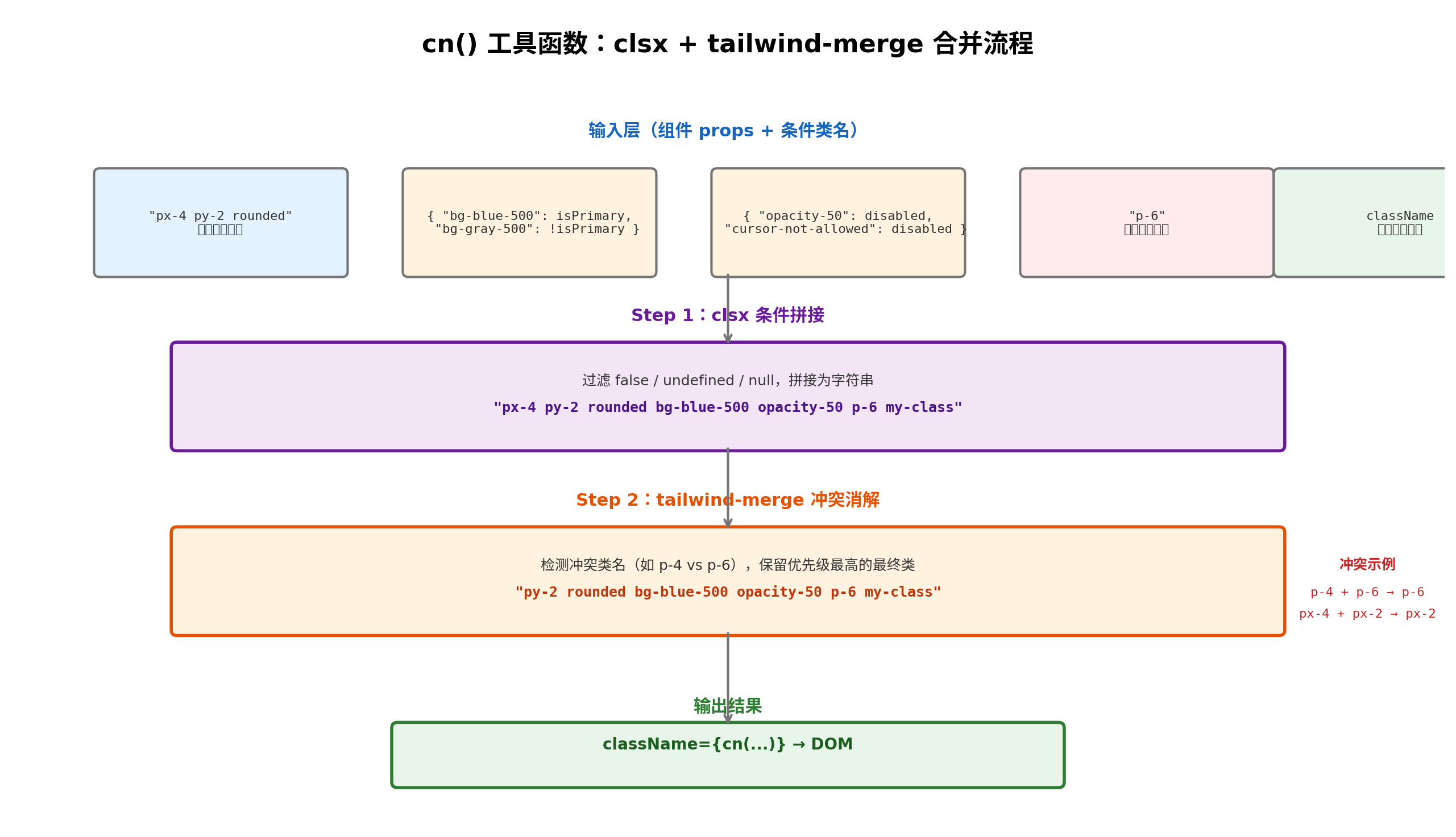
tailwind-merge 专门解决这个问题。它内置了 Tailwind 的类名优先级规则,能够智能地合并冲突类名,确保"后面的覆盖前面的"。clsx 则负责条件类名的拼接,支持字符串、对象、数组等多种输入形式。两者组合成的 cn 函数已成为业界标准实践:
// lib/utils.ts
import { clsx, type ClassValue } from 'clsx';
import { twMerge } from 'tailwind-merge';

export function cn(...inputs: ClassValue[]) {
  return twMerge(clsx(inputs));
}
在组件中的典型使用方式如下:
// components/Button.tsx
import { cn } from '@/lib/utils';

interface ButtonProps extends React.ButtonHTMLAttributes<HTMLButtonElement> {
  variant?: 'primary' | 'secondary' | 'ghost';
  size?: 'sm' | 'md' | 'lg';
}

export function Button({
  variant = 'primary',
  size = 'md',
  className,
  disabled,
  ...props
}: ButtonProps) {
  return (
    <button
      className={cn(
        // 基础样式
        'inline-flex items-center justify-center rounded-md font-medium transition-colors',
        'focus-visible:outline-none focus-visible:ring-2 focus-visible:ring-offset-2',
        // 尺寸变体
        {
          'h-8 px-3 text-sm': size === 'sm',
          'h-10 px-4 text-sm': size === 'md',
          'h-12 px-6 text-base': size === 'lg',
        },
        // 颜色变体
        {
          'bg-primary text-white hover:bg-primary/90': variant === 'primary',
          'bg-muted text-text hover:bg-muted/80': variant === 'secondary',
          'bg-transparent text-text hover:bg-muted': variant === 'ghost',
        },
        // 禁用状态
        disabled && 'opacity-50 cursor-not-allowed pointer-events-none',
        // 外部传入类名(优先级最高)
        className
      )}
      disabled={disabled}
      {...props}
    />
  );
}
cn 函数的处理顺序至关重要:先由 clsx 将所有条件表达式解析为字符串,再由 tailwind-merge 消除冲突。如果顺序颠倒,twMerge 无法处理布尔值和对象,会导致运行时错误。
五、暗色模式:dark: 修饰符与 CSS 变量的联动
暗色模式的实现是检验 Design Token 体系成熟度的试金石。Codex 官网采用 CSS 变量 + Tailwind dark: 修饰符的双轨方案:
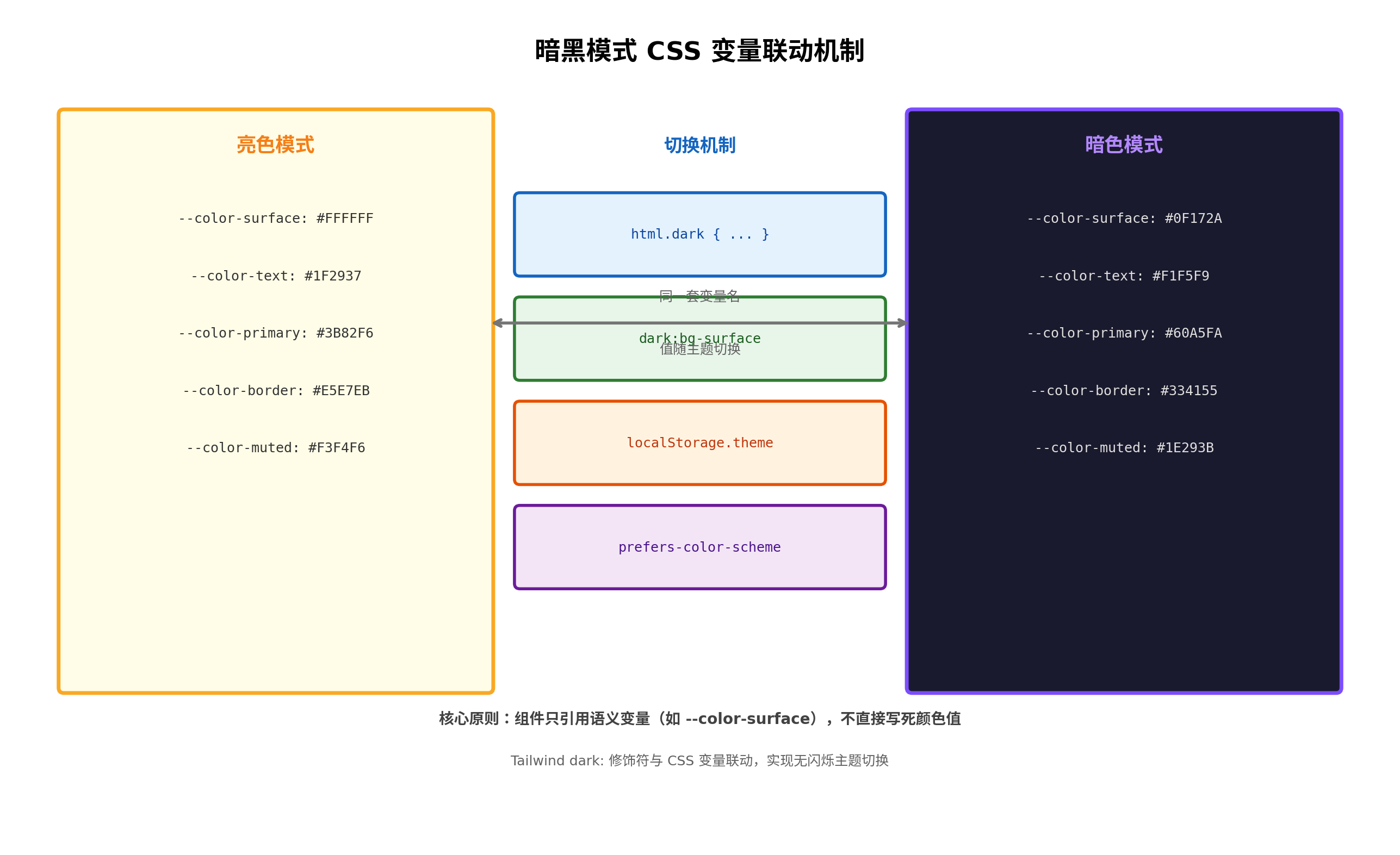
核心思路是保持变量名不变,只改变变量值。在 :root 中定义亮色模式的变量值,在 html.dark 选择器中覆盖为暗色模式的值:
/* styles/tokens.css */
:root {
  --color-surface: #FFFFFF;
  --color-text: #1F2937;
  --color-primary: #3B82F6;
  --color-border: #E5E7EB;
  --color-muted: #F3F4F6;
}

html.dark {
  --color-surface: #0F172A;
  --color-text: #F1F5F9;
  --color-primary: #60A5FA;
  --color-border: #334155;
  --color-muted: #1E293B;
}
Tailwind 配置中开启暗色模式支持:
// tailwind.config.ts
const config: Config = {
  darkMode: 'class', // 使用 class 策略,由 JS 控制 html 类名
  // ...
};
主题切换脚本需要在页面渲染前执行,避免闪烁:
// hooks/useTheme.ts
import { useEffect, useState } from 'react';

type Theme = 'light' | 'dark' | 'system';

export function useTheme() {
  const [theme, setTheme] = useState<Theme>(() => {
    if (typeof window === 'undefined') return 'system';
    return (localStorage.getItem('theme') as Theme) || 'system';
  });

  useEffect(() => {
    const root = document.documentElement;
    const systemDark = window.matchMedia('(prefers-color-scheme: dark)').matches;

    if (theme === 'dark' || (theme === 'system' && systemDark)) {
      root.classList.add('dark');
    } else {
      root.classList.remove('dark');
    }

    localStorage.setItem('theme', theme);
  }, [theme]);

  return { theme, setTheme };
}
在组件模板中,使用 dark: 修饰符处理那些无法通过 CSS 变量自动切换的场景:
<div className="bg-surface text-text border border-border dark:border-border/50">
  <h1 className="text-2xl font-bold dark:text-white">
    标题文字
  </h1>
  <p className="text-muted-foreground dark:text-gray-400">
    描述内容
  </p>
</div>
需要注意的是,dark: 修饰符应当作为 CSS 变量的补充而非替代。理想情况下,大部分颜色切换应通过变量值变化自动完成,只有少量特殊场景(如图片遮罩、阴影颜色)需要显式使用 dark: 修饰符。
六、总结
Tailwind CSS 与 Design Token 的融合,本质上是在"原子化灵活性"与"系统化一致性"之间架设桥梁。通过 CSS 变量作为中间层,设计系统的变更可以无缝传导至所有组件;通过自定义插件,品牌特有的视觉语言被编码为可复用的工具类;通过 cn 函数,组件的样式组合既灵活又可靠。
这套体系在 Codex 官网中已稳定运行超过一年,支撑了从营销页面到管理后台的多种场景。实践证明,当 Design Token 成为设计与开发的共同语言时,团队协作效率和产品视觉一致性都能得到显著提升。
转载自:https://blog.csdn.net/sghtgjfhv/article/details/164188639
欢迎 👍点赞✍评论⭐收藏,欢迎指正

葡萄城是专业的软件开发技术和低代码平台提供商,聚焦软件开发技术,以“赋能开发者”为使命,致力于通过表格控件、低代码和BI等各类软件开发工具和服务,一站式满足开发者需求,帮助企业提升开发效率并创新开发模式。
更多推荐
 14
14 0
0- 0


 已为社区贡献16条内容

所有评论(0)